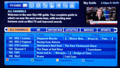
Sky+HD is being updated in the biggest change to Sky’s EPG since 1998. Once the change is implemented a few changes will be noticed on the layout of the home screen. This is because BskyB have decided to completely change things and want their new EPG to really focus on Catch-up TV.
There has been a huge increase in the demand for Catch-up TV and this new introduction from sky certainly makes it easier to find the on-demand content that customers want. The changes will not be rolled out to everyone just yet, but gradually over the next few months it will be introduced. This means that the on-demand services such as Sky Store and Sky+ Planner will now be alongside the usual channels, making things look smoother and simpler.
For those people who have already seen the change they will notice that the new homepage has a new search box which gives viewers the chance to really search for what they want based on actors, channels and certain keywords. It has never been so easy to find what you want. The home screen will now consist of Catch-Up TV, Box Sets, New Series, Best of On Demand and the Sky Store. These new windows will allow the viewer to navigate easily around the system to really find what they want. The visual improvements are for the better and everything is sharper than previously, with icons and text looking flatter with no rounded edges, which seems to be all the rage these days. This change does not need to worry those who are not keen on change as the whole interface still feels like Sky+ and that can only be a good thing.
One feature that jumps out at you is the “New Series” menu that is visible on the homepage. When this is clicked, access is given to all the new shows that have been shown on the Sky, Catch-Up TV has never been so popular and this is why Sky are really pushing for this to be the main feature of their system. The idea behind this is that they want viewers to discover new content quicker than ever, which can hopefully make it easier for viewers to decide what to watch as there has never been so much amazing television to choose from.
Alongside the new updated EPG, Sky are also planning to update their apps on offer so that they reflect the new EPG. The apps will provide a similar look and feel and it will enable the viewer to really be in control on the move. Being able to switch off the Sky+HD box using your phone is a great addition and being able to queue Sky Store Titles certainly brings the world of television to the fingertips of viewers.


